Buying Guides
How the Artwork Proofing Process Works for Custom Logo Mats
If you're ordering a custom logo mat, the artwork stage matters more than most people expect. A clear file and a careful proof check can save days of back-and-forth and help you avoid problems that only show up after approval. This guide walks you through what to send, what a proof is likely to show, where weaker artwork can cause compromises, and what to check before you sign anything off.

A logo file pulled from an old email or copied from a website is often the starting point when you need a custom mat ordered quickly. For custom logo mats, the best artwork is usually a clean vector file where the mat range accepts it, because it scales neatly and gives the clearest basis for a proof; PDF, AI, EPS and SVG may be suitable in some cases, while PNG and other image files can still work if they are large and clear enough. Get this stage wrong and you can end up approving a design with soft edges, cramped text or colours that are not what you expected. This guide explains what to send, how the proofing process usually works, and what to check before approval.
Send the best file you have
If you have proper brand artwork, send that first. In most cases, the strongest starting point is vector artwork where it is supported for the mat you are ordering. That is the kind of file a designer can scale up or down without the logo turning fuzzy around the edges.
Common vector formats can include PDF, AI, EPS or SVG, but this needs checking against the specific mat range and ordering route you are using. Not every format is accepted everywhere, and not every PDF is a true vector file.
If you do not have vector artwork, send the clearest image file you can find. A large PNG can be useful, especially if it has a transparent background, because it makes the logo easier to place without a white box around it. Other raster image files may still be workable, but the result depends on how sharp the original is and how complex the logo needs to be on the mat.
What makes artwork easier to work with
- A clean file taken from your brand pack rather than copied from a website or screenshot
- Sharp edges on text and shapes
- A transparent background where available
- Separate details for colours and fonts if your branding is tightly controlled

What often causes delays
- Small logos pulled from email signatures or social media
- Screenshots pasted into a document
- Files with missing text, odd spacing or a background that should not be there
- Artwork with very fine detail, thin lines or tiny text that may not reproduce well
If the only file you can find is low quality, send it anyway rather than holding up the order, but expect questions. In some cases, a designer may be able to tidy it up or rebuild simple parts of it. In others, the proof will show the limits of the original artwork and you may need to supply something better before approving it.
Tell them the colours you mean
Colour problems usually start with silence. If you know your brand colours, include the reference when you upload the artwork or when you reply to the proof. That gives the design team a clearer target than saying “use our usual blue”.
If you have brand guidelines, send them with the logo. If you do not, a note with the colour references you use internally is still helpful. This might be the difference between a quick approval and a round of avoidable revisions.
You should also expect the screen preview and the finished mat not to look identical. Screens display colour with light, while a mat is a physical product viewed in real lighting at your entrance or reception desk. A proof is there to show design intent, layout and overall appearance, not to promise an exact on-screen match to the finished piece.
What usually happens after you upload the artwork
The proofing process is there to turn your file into something you can check before production starts. The exact steps can vary by product and service, but the usual path is simple: upload the artwork, review the proof, request any changes needed, then approve it when you are satisfied.
Some ranges may show a preview quickly, while others may involve more manual design support. If the artwork is straightforward and the file is strong, the process is usually smoother. If the logo is low quality, the background needs removing, or the proportions look wrong on the mat shape, that is when revisions are more likely.
A proof is not just a courtesy image. It is the point where you can still correct the layout, colours, spacing and wording before the order moves on. Once you approve it, the design is treated as ready to make.
Premium Custom Floor Mats are worth looking at if you want to see a typical custom logo mat range before you prepare files, because it helps to know the sort of product your artwork is being adapted for.
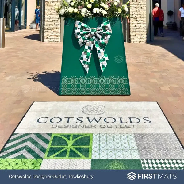
Logo Mats - Premium Custom Floor Mats
- Custom Branding: Feature your logo, company name, or message.
- Slip-Resistant: Rubber backing ensures stability on different floor surfaces.
- High-Quality Print: Vibrant, long-lasting logo and colours.
- Dirt & Moisture Control: Helps keep floors cleaner in busy areas.
From £45.00 + VAT
If your proof is not right, be specific about the change. “Please enlarge the text and centre the logo” is useful. “It still looks a bit off” is harder to act on and often leads to another round of emails.
Useful revision requests
- Please make the logo larger within the mat area
- Please centre the artwork top to bottom
- Please keep the symbol and text in their original proportions
- Please remove the white background behind the logo
- Please use our supplied colour reference for the main brand colour
If the issue is bigger than a small correction, say so clearly. For example, if the text has become hard to read, a fine detail has disappeared, or the shape of the logo looks stretched, ask for a fresh proof rather than approving with reservations.
What to check before you approve the proof
Approval is the moment to slow down. A rushed sign-off causes more disappointment than the upload stage, because this is your last proper chance to catch avoidable issues.
- Spelling and punctuation, especially in taglines or department names
- Logo proportions, so nothing looks stretched, squashed or cropped oddly
- Placement on the mat, including whether it feels centred and balanced
- Text size and legibility, especially if the wording is small
- Fine detail, thin lines and small elements that may lose clarity
- Colour intent, based on the references you supplied
- Background treatment, including whether a transparent area has been handled properly
If several people need to sign off the design internally, send the proof round before approval rather than after. That matters in schools, offices and multi-site organisations where marketing, facilities and senior staff may all notice different things.
When to stop and ask questions
Do not approve a proof if you are still hoping the final mat will somehow fix an issue you can already see. If the text feels too small on screen, if the logo edges look rough, or if a colour note has been missed, ask the question before sign-off.
That is also the point to raise concerns about artwork quality. If your logo came from a weak source file, ask whether the proof reflects the best available result or whether a better original file would improve it.
Common problems with weaker artwork
Most proofing issues come back to the source file. A weak image can still be enough for a simple logo, but the more detail you ask it to carry, the more likely something will need simplifying or correcting.
- Tiny text may become hard to read
- Fine outlines can lose definition
- Gradients and subtle fades may not come through as expected
- Busy logos can feel cramped on smaller mat sizes
- Copied web graphics can look soft when scaled up
This does not mean the order has to stop. It means you should expect a practical conversation about what can be reproduced clearly and what may need adjusting for the mat format.
If you want to see how design and production pressure can affect a branded mat order, this case study gives useful context around handling a premium logo mat project to a deadline.
You can also browse the logo mats range if you need to sense-check the type of product your artwork will sit on before you send files across.
How to make approval faster and safer
The quickest way to keep things moving is to send one strong artwork file, include any known brand colours, and give clear revision notes when something needs changing. Keep those notes short, direct and itemised if there is more than one change.
Before you approve, look at the proof as if it has already been made and delivered. Check the words, the placement and the overall balance, then ask for changes where needed instead of hoping they will sort themselves out later. If you are about to place an order, gather the best logo file you have and send the colour information with it from the start.