Buying Guides
How to Choose the Best Colours for a Logo Mat
Choosing colours for a logo mat starts with one rule: the logo needs to stand out clearly in the real entrance where people will see it, not just on a brand sheet. After that, you can weigh up whether the background will still look presentable with daily foot traffic, damp shoes and indoor lighting. This guide explains how to judge dark and lighter backgrounds, when to simplify artwork, and why checking a proof matters before you approve a custom mat.

An entrance mat that carries your logo has to do two jobs at once: look right for your brand and still work in a space that sees wet shoes, dust and steady foot traffic. The best colours for a logo mat are usually the ones that keep the logo easy to recognise at a glance, with enough contrast between the background and the artwork, while still suiting the way the entrance will look day to day. Get this wrong and the branding can fade into the mat visually, or the entrance can start to look untidy sooner than you expected. This guide shows you how to balance contrast, brand consistency and everyday practicality before you approve the artwork.
Start with visibility, not exact brand matching
Your first check is simple: can someone recognise the logo from a few steps away? If the answer is no, the colour choice is not doing its job.
Strong contrast matters because people need to pick out the logo quickly. UK government guidance on colour and contrast reinforce the same principle: colour choices need enough contrast to stay clear, and colour alone should not be relied on to carry meaning. For a logo mat, that means a logo should not sink into a background that is too close in tone.
This is why an exact brand colour match is not always the best place to start. A combination that works on stationery or a website may be less readable on a floor mat at an entrance. If a small adjustment makes the logo clearer without losing brand recognition, it is often the better choice.
How to think about dark and lighter backgrounds
Dark backgrounds are often a sensible option because they can make many logos stand out well and can feel easier to live with in a busy entrance. But they are not automatically right for every site, every logo or every floor finish.
Lighter backgrounds can also work well, especially when the logo colour sits clearly against them and the entrance itself is bright and clean-looking. The problem comes when the background and the logo do not separate clearly enough, or when the mat's day-to-day appearance matters more than it did on the original artwork.
When a dark background may help
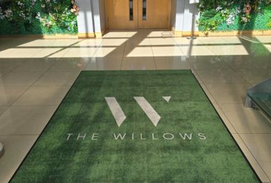
A dark background can suit receptions, school entrances and office lobbies where you want the logo to read cleanly and where darker flooring or darker entrance frames already shape the look of the space. If your logo includes light elements, they may stand out strongly on a darker base.

If your logo is mostly dark, you may need to lighten some elements for the mat artwork. That is not a problem in itself, but you should check whether the revised version still feels recognisable and on-brand rather than just technically visible.
When a lighter background may suit better
A lighter background can be the right choice when it fits the wider entrance design and still gives the logo enough contrast. This can work well for brands with dark, bold artwork or for spaces where a lighter entrance scheme is part of the look you want visitors to see first.

Just be careful not to assume the proof tells the whole story. A lighter mat may look right on screen but feel different once it is placed under real entrance lighting and regular traffic.
Choose colours for the real entrance, not just the logo file
Colour choice should be judged in context. A mat at a quiet internal reception desk can be treated differently from one just inside a main door where people bring in moisture and grit all day.
The HSE guidance on flooring makes the wider point that contamination needs to be managed so people can move safely. For you, that means the colour decision is not only about branding. It is also about how the mat will look as it is used and cleaned over time.
Look at these practical factors together:
- how bright or dim the entrance is
- whether the surrounding floor is light, dark or patterned
- how much footfall the mat will take
- whether people arrive with wet shoes, dust or mud
- how often the area is cleaned and checked
A mat that looks sharp in isolation may feel much less effective once it sits against similar floor colours or under uneven lighting. So judge the colours against the actual entrance, not a blank white page.
Simpler artwork usually reads better on a mat
Logo mats are viewed quickly and from standing height. That is why simple artwork usually performs better than busy artwork with lots of small changes in tone.
If your logo includes fine detail, multiple shades or small text, check whether those parts are really needed on the mat. In many entrances, the strongest result comes from keeping the main logo shape, key brand colours and the most recognisable elements, then dropping detail that will not add much at a glance.

This does not mean changing your identity beyond recognition. It means choosing the version of the logo that is most likely to stay clear in this format. If dark logo elements need to become lighter on a dark background, or if several similar shades need reducing, review the result as a branding decision, not only as a design tweak.
The goal is clear recognition. If someone can tell immediately who the mat belongs to, the design is doing its job.
Use the proof to test colour choices properly
Before you sign anything off, test the colour combination in a proof rather than relying on your first instinct. First Mats provide an instant proofing workflow, free revisions and a designer check before print, which gives you a practical chance to compare options before approval.
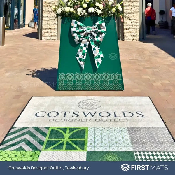
Logo Mats - Premium Custom Floor Mats
- Custom Branding: Feature your logo, company name, or message.
- Slip-Resistant: Rubber backing ensures stability on different floor surfaces.
- High-Quality Print: Vibrant, long-lasting logo and colours.
- Dirt & Moisture Control: Helps keep floors cleaner in busy areas.
From £45.00 + VAT
Use that stage to check a few specific things:
- does the logo still stand out clearly when viewed quickly
- does the background help the artwork rather than compete with it
- if colours have been adjusted, does the logo still feel like your brand
- have any small details become harder to read than expected
- does the overall look suit the entrance where the mat will sit
It is also worth confirming any artwork requirements and available colour options with the supplier before final approval. Many Logo Mat suppliers, including First Mats, will be able to advise on which colours will work well on your mat.
A practical way to make the final choice
If you are stuck between two or three options, use this order.
- Pick the version with the clearest contrast between logo and background.
- Check whether it still feels recognisable as your brand.
- Judge how it will look in the actual entrance once the mat is in daily use.
- Review the proof and ask for changes where visibility drops.
- Approve the option that balances branding with the realities of that doorway.
You do not need the most exact-looking version on screen. You need the version that still works on the floor, under entrance lighting, with people walking across it all day. If you are reviewing artwork now, compare one dark-background proof and one lighter-background proof before you approve the mat.