Buying Guides
How to Choose the Best Door Mat Colour for Your Home or Business
Choosing a door mat colour is partly about style, but it is also about how the entrance looks between cleans. The right colour depends on the mess that turns up there, how often you clean, and whether the mat needs to blend in or stand out. This guide explains when darker, lighter and mottled finishes tend to be more forgiving, how common colour families change the look of a space, and what to think about for home and business entrances.

A front door mat covered in wet footprints, dust or garden grit is where this choice stops being just about colour. The best door mat colour is the one that suits the entrance, works with the surrounding floor, and does not look tired the moment everyday mess lands on it. Get it wrong and a mat that looked smart on day one can start to look marked very quickly. This guide shows you how to weigh appearance against traffic, dirt, lighting and cleaning so you can choose with a bit more confidence.
Start with what the entrance has to cope with
Before you think about décor, think about the mess that actually arrives at that door. A neat front entrance used a few times a day has very different needs from a back door used by children, pets or muddy boots. The same goes for a quiet office entrance compared with a busy reception.
Colour matters because it changes how noticeable everyday marks look. It does not decide hygiene, durability or slip resistance on its own. The material, surface texture, finish and cleaning routine all play a part as well.
A practical way to choose is to weigh up three things:
- how the mat should look in the space
- what kind of dirt and marks usually land on it
- how often you are willing to clean it
If the mat will see a lot of traffic and only get cleaned now and then, mid-tone or mixed-colour finishes are often easier to live with visually than very plain light shades.
What dark, light and mottled colours tend to do
There is no single best colour for every doorway, but different colour approaches do have different trade-offs.
Dark shades
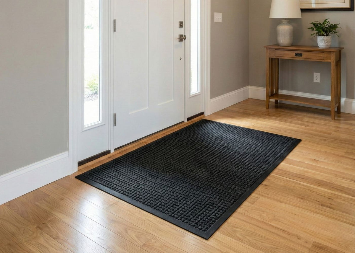
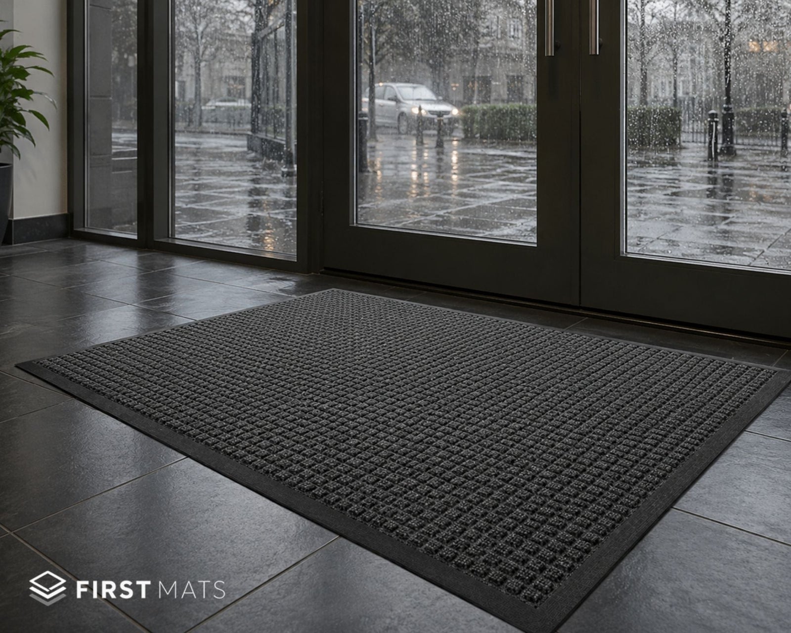
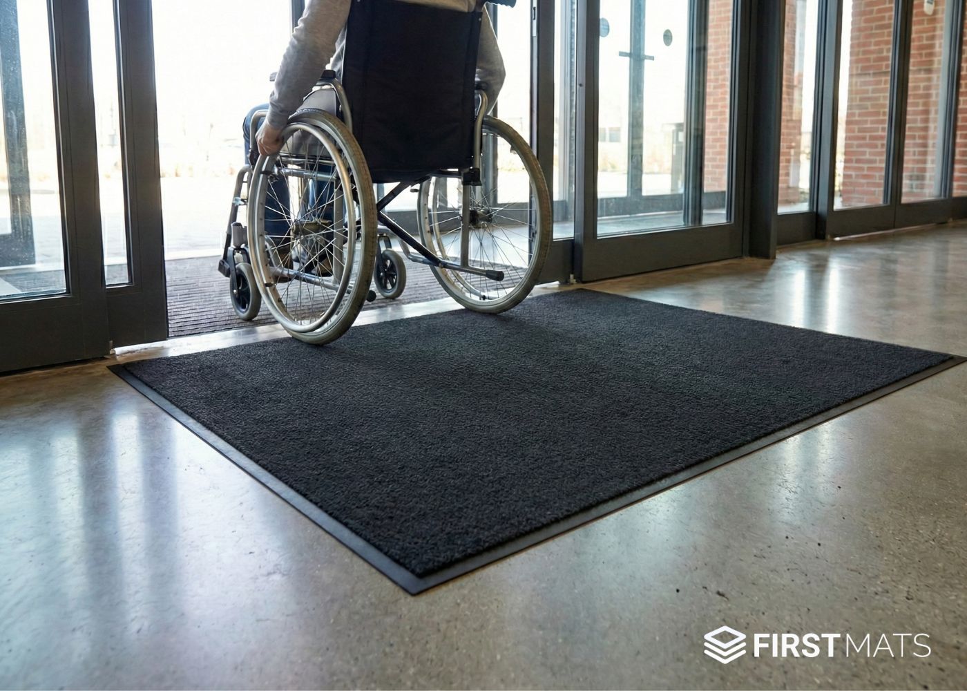
Black and dark grey often suit busy entrances because they can make some everyday marks less obvious at a glance. They also sit easily with many modern floors and commercial interiors. The trade-off is that pale dust, lint and some dried residue may show more clearly on a very dark plain surface.
Light shades
Lighter mats can look softer and may suit calm, decorative spaces with lighter flooring. They usually need a bit more upkeep if the entrance gets regular wet shoes, garden dirt or heavy foot traffic, because marks can become obvious sooner.
Mottled or flecked finishes
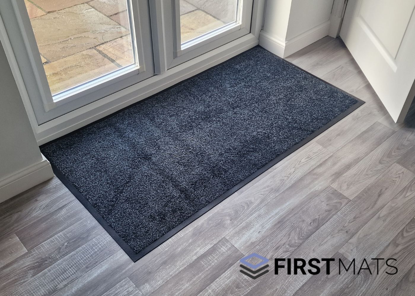
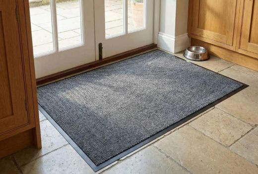
If you want something forgiving without going very dark, mottled finishes are often a sensible middle ground. A mixed tone or flecked pattern can make day-to-day dirt and wear look less obvious than a flat, uniform colour in some settings. That is why they are worth a look when practicality matters as much as appearance.

Research and guidance around entrance areas also support looking at the whole environment, including contamination, lighting and contrast, rather than treating colour as a standalone performance factor. In homes and businesses alike, a mat that contrasts clearly enough with nearby flooring can be easier to notice, especially where accessibility matters. You can read more about visual contrast in Approved Document M and in this visual contrast design note.
How common colour families change the look of an entrance
Colour choice is still a design decision, so it helps to know what each family tends to do in a space.
Brown and coir-style looks
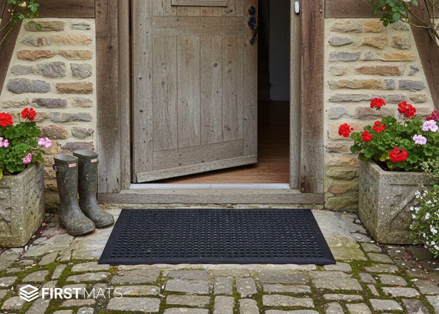
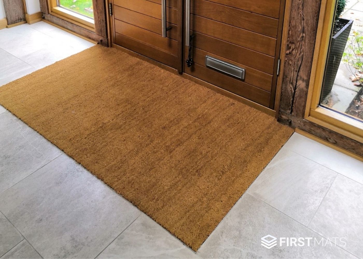
Brown shades tend to feel warm, familiar and easy to place in traditional or natural-looking entrances. They often work well with timber, stone-look flooring and older properties. If you like a coir-style look, keep it as an aesthetic preference rather than assuming it will always be the most practical choice.

Black and dark grey
These usually give a cleaner, more understated look. They work well in modern homes, offices and customer-facing spaces where you want the entrance to feel neat without drawing too much attention to the mat itself. They can also be a sensible choice where you expect a steady flow of shoes through the day.
Red, green and blue
Accent colours are mainly about how the entrance feels. Red can look welcoming or more formal depending on the setting. Green can sit well with natural finishes. Blue often feels calm and tidy, which is why it is common in many professional interiors. None of these colours is inherently better or worse for cleanliness. They only work if they suit the décor, the traffic level and the amount of upkeep the mat will get.

Home and business entrances need different thinking
The same colour will not always make sense in both settings, even if the mat itself looks good online.
For homes
At home, the question is usually how much mess arrives through that door and how visible you want the mat to be. A busy family back door often benefits from a darker or mixed-tone look that is a bit more forgiving between cleans. A tidy front entrance with lighter flooring may suit a lighter or warmer shade if traffic is low and you do not mind keeping on top of it.
If pets use the entrance, think about paw marks, loose hair and damp patches rather than only mud. Dark colours may make some of that less noticeable, but they can also show pale pet hair quite clearly.
For businesses
In a business setting, colour usually has to do two jobs at once. It needs to fit the space visually and still cope with regular use. Neutral dark tones are often easier to place in receptions, shared entrances and staff access points because they feel professional and are less demanding visually. If brand fit matters, an accent colour can work well, but it still needs to make sense for the traffic, lighting and cleaning schedule.

For public-facing entrances, visual contrast is also worth thinking about. Poor contrast can make an entrance harder to read. The HSE's guidance on slips and trips also points to the need to assess contamination, lighting and visibility in entrance areas.
If accessibility is a key concern in your setting, this related guide may help: the best colour door mats for people with dementia.
A quick colour guide for real entrances
- Choose dark shades when the entrance is busy, you want a neutral look, and you need something that may be more forgiving visually for everyday marks.
- Choose lighter shades when the entrance is lower traffic, appearance matters most, and you are happy to clean more often.
- Choose mottled or flecked finishes when you want a practical middle ground that softens the look of day-to-day dirt and wear.
- Choose brown or warm natural tones when you want the mat to feel at home with timber, stone-look or more traditional interiors.
- Choose accent colours when the mat is part of the design of the space, but only if the entrance conditions still make that choice realistic.
How to make the final choice without overthinking it
Look at the floor around the mat first. If the mat disappears into a similarly dark floor, it may look smart, but it may also be harder to notice clearly. If it clashes too sharply with everything around it, it can feel out of place. Aim for a colour that looks intentional and easy to read in the space.
Next, be honest about cleaning. If you know the mat will not be vacuumed, shaken out or washed down very often, choose a colour and finish that are more forgiving. This is where darker mid-tones and mottled styles usually earn their place.
Then think about what the dirt actually looks like. Dry dust, pale grit, wet footprints, leaf fragments and pet hair all show up differently depending on the colour and surface. That is why colour alone will never tell you how a mat will look after a week of use.
If you are torn between two colours, the safer choice is usually the one that fits the floor, suits the light in the entrance, and asks the least from your cleaning routine. Pick for real life, not for the product photo.
When you are ready to compare actual mats, use colour as one filter, not the whole decision.